Fundraising Metrics Dashboards for Startup Founders
Founders confuse dashboards built for themselves with ones built for investors.

About 90% of startups fail, and a lot of that traces back to founders who never built the financial discipline to see trouble coming before it landed on them (per opstart.co's 2025 guide). A fundraising metrics dashboard is supposed to fix that blind spot. Most founders build the wrong one anyway: a command center meant for their own daily use, handed to investors wholesale, and then they wonder why the meeting goes sideways.
Founders confuse a dashboard for themselves with a dashboard for investors, and those are two different documents doing two different jobs. Investor dashboards answer one question: is this company scaling efficiently? Founder dashboards answer a different one entirely: what needs to happen today? A big pipeline can hide bad targeting, same way a founder who takes forty meetings and closes zero term sheets already knows volume isn't proof of anything. Piling every metric you track onto one slide doesn't demonstrate command of the business. It demonstrates the opposite. Startups that track their metrics grow about 20% faster than those that don't, so tracking itself is table stakes. Curating what you actually show an investor, cutting the noise down to the numbers that answer their specific question, is the skill nobody teaches and almost every founder skips.
What "stage-appropriate" actually means before the metrics show up
Traction isn't one fixed idea. It moves depending on what stage a company sits at and what kind of business it runs. Benchmark data breaks it down cleanly: traction requirements shift materially at each stage, from early customer validation at pre-seed through demonstrated product-market fit at seed and expansion readiness at Series A. Four different jobs. Four different report cards, and mixing them up is the fastest way to look like you don't know what round you're actually raising.
For SaaS specifically, FI.co's benchmarks put Series A monthly revenue at $200,000-plus, with seed and pre-seed stages sitting at progressively lower thresholds, and a full year of cohort data expected behind a Series A raise.
The paperwork changes too, and founders underestimate how much that matters. Pre-seed and seed rounds usually run on SAFEs or convertible notes, loose instruments that don't demand pinpoint precision. Series A rounds are priced, which means the numbers backing the round need to survive actual scrutiny, not vibes. The investor pool shifts in step: the investor pool grows more institutional with each stage, and by Series A the people across the table have reviewed enough of these dashboards to know exactly which line is padding.
A pre-seed founder who leads with CAC payback is telling an investor they don't understand what stage they're at. A Series A founder who shows up without twelve months of cohort data is telling an investor something too, just not on purpose. Dashboard architecture is itself a message, whether the founder means to send it or not.
Metrics that belong on a pre-seed dashboard
Pre-seed investors aren't checking efficiency. They're checking whether the idea has legs at all, so the dashboard should read like a thesis, not a P&L.
Start with Total Addressable Market, top-down or bottom-up, whichever estimate is more honest for the business. VCs apply what Burkland Associates calls the "10x Rule," looking for at least 1,000% growth potential before a check makes sense. Pair that with early signal, and by early signal, this means paying customers, not just people kicking the tires. A handful of paid pilots, an executed proof of concept, or the first sliver of MRR does more work here than any slide of hockey-stick projections ever will.
Burn rate and runway come next, tracked in real dollars per month and recalculated often enough that the number on the dashboard never goes stale. Most investors want to see 18 to 24 months of runway per round (per Qubit Capital), so show the math behind that number, not just the conclusion. Round it out with a directional CAC figure, even a rough one. Precision isn't the point. Showing the founder is already thinking about acquisition economics matters far more than discovering the concept exists six months later.
Leave LTV:CAC, net revenue retention, and cohort retention curves off. There aren't enough customers yet to make any of those numbers mean anything, and putting them up anyway reads as padding, not sophistication. At this stage, the dashboard is a narrative machine: TAM plus early signal plus capital discipline equals the thesis, spelled out in numbers instead of adjectives.
A clean, well-labeled Google Sheet does the job fine here. A slick SaaS dashboard sitting on top of thin data actively works against the founder. It looks like the tool is compensating for something, because it is.
Metrics that belong on a seed dashboard
Seed investors want to know two things: does the product retain customers, and is revenue growing in a way that justifies another 18 to 24 months of runway. Burkland Associates lays out the core metrics for this stage, and each one earns its spot for a specific reason, not out of habit.
Market sizing context is still relevant, but it now needs a sharper defense than a back-of-napkin guess. CAC, calculated as total sales and marketing spend divided by new customers acquired, should trend down or at least hold steady while showing it's repeatable. LTV, using average revenue per account times gross margin divided by revenue churn rate, feeds directly into the ratio investors actually care about: LTV:CAC. A 3:1 ratio is the floor, not the goal, so anything under that needs an explanation ready before the question gets asked out loud.
ARR growth matters more as a trend than as a single number sitting alone on the page. The median ARR growth rate for SaaS startups under $10 million ARR was 50% in 2023, per KeyBanc's annual SaaS survey, a real anchor instead of a guess at what "good" looks like. Customer retention rate gets the most scrutiny of anything on this dashboard, and for good reason. Burkland puts 85 to 90% as the healthy range for SaaS or subscription businesses at seed. That's the closest thing to a product-market-fit proxy investors get when the customer count is still small enough to count on two hands.
Burn rate splits into gross and net here, shown next to runway in months, not as a vague "we're fine for now" wave of the hand.
Even two or three cohorts showing a retention curve turn a claim into evidence. That's the gap between telling an investor "our customers stick around" and actually showing them the line that proves it. Net revenue retention needs a caveat at this stage, though: with a small customer base, NRR swings wildly and can mislead more than it informs. Show it if the sample size supports it, and have the sample size ready to explain the second someone asks.
Metrics that belong on a Series A and Series B dashboard
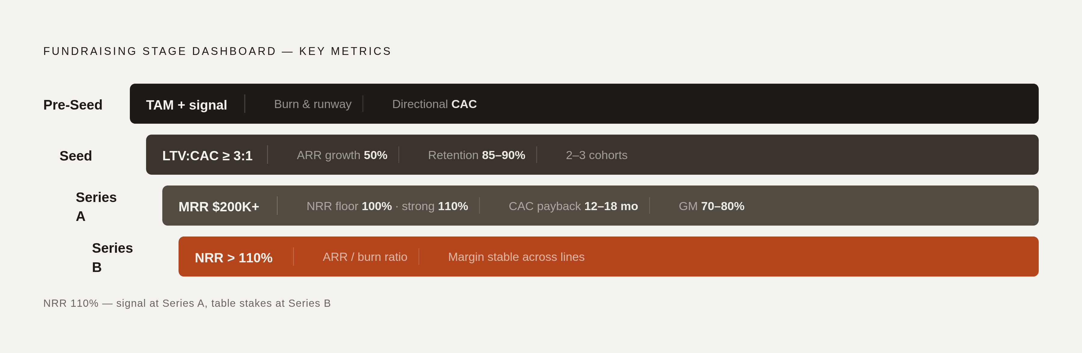
The 2024 Series A market got harder, and investors have been blunt about why: crossing $1 million in ARR used to be enough to get a term sheet. It isn't anymore. The market shifted toward pipeline predictability and capital efficiency as the deciding factors, so the dashboard now has to prove discipline, not just growth.
ARR and its growth rate still anchor the story, with that same 50% benchmark for sub-$10M ARR companies, per Burkland Associates, still the number to beat. But Series A investors want the trend stretched out across time, not a single snapshot pretending to speak for the whole business. Pipeline predictability sits right next to it: pipeline-to-quota ratios, sales cycle stability, the kind of consistency Tunguz argues investors are explicitly paying for in an uncertain market.
CAC payback period needs its own line, running around 12 months for SMB or PLG models and 12 to 18 months for enterprise (per visible.vc). LTV:CAC is still required, but now it has to hold steady across multiple cohorts, not just look good in aggregate. Gross margin belongs on the dashboard too, targeted at 70 to 80% for SaaS businesses, and Net Revenue Retention becomes the headline metric of the whole page, full stop. A floor of 100% means the existing customer base isn't shrinking. Anything above 110% is a strong signal. Below 100%, and the business is quietly losing ground even while new logos keep walking in the door.
Runway still needs 18 to 24 months planned post-round, but now it comes with a forward model attached, showing exactly which milestones that capital is supposed to hit and by when. Twelve months of cohort data isn't optional anymore, either. At Series A, it's widely treated as table stakes for SaaS diligence.
Series B raises the bar again. NRR above 110% moves from "strong signal" to expected, not impressive. Gross margin needs to hold steady across product lines, not just in the blended average where a weak line item can hide. Efficiency ratio, meaning ARR generated per dollar burned, becomes its own line item, reflecting the broader shift toward efficiency-first investing that has defined the post-2023 fundraising environment.
Startups with strong retention and profitability metrics secured 25% more funding in 2024 compared to those without, according to Lucid, and closing that gap is exactly what a Series A or B dashboard is built to do. What earlier-stage dashboards don't need, and this one absolutely does, is a forward model: not just where the business stands today, but where this specific round of capital takes it, and by when.
How to structure the dashboard so it holds up in diligence
Three rules make a dashboard survive contact with a diligence team.
First, every metric needs a source and a calculation date attached to it. An ARR figure with no date on it is meaningless. It's a rumor with decimal points. Second, show the trend, not the point. One number is an assertion. Six or twelve months of that same number moving over time is evidence, and evidence is what actually gets a term sheet signed. Third, separate what's actual from what's projected clearly enough that nobody has to ask, because investors will ask anyway, and the dashboard should answer before the question fully leaves their mouth.
One thing founders skip constantly is the forward model. Investors at Series A and beyond want to see exactly how the capital they're about to hand over turns into the metrics needed for the next round. Skip that, and the dashboard reads like a report card with no plan stapled to it.
Narrative coherence matters just as much as any individual number does. If ARR growth looks great but burn is climbing and retention is flat, that's not automatically a red flag. It is a tension that needs an explanation sitting right there on the page, though, because left unaddressed, it reads as something the founder either missed or is hoping nobody notices.
Remember the audience filter here: this dashboard serves one narrow purpose, separate from the founder's daily operating view and separate from the board's strategic deck. It answers one specific investor question: is this business scaling efficiently, and will more capital speed that up. Every number should trace straight back to the data room. If an investor pulls a source document and it doesn't match what's on the dashboard, the whole thing loses credibility in a single click. Recalculate runway and burn weekly at minimum, retention and ARR on a monthly cohort basis, and show the recalculation date next to each figure. That date does more trust-building work than most founders realize.
And if a number is missing, say why. A gap that looks like an oversight reads exactly like a weakness investors haven't found yet, unless the founder gets ahead of it with a one-line explanation sitting right next to the hole.
Which tools fit which stage of dashboard build
Pre-seed and pre-revenue founders don't need software. They need a spreadsheet that doesn't lie to them. Most early-stage VCs want a three-statement model, meaning profit and loss, balance sheet, and cash flow, with a three-year monthly forecast built directly into Google Sheets or Excel. Revenue drivers need to sit clearly apart from cost assumptions, hiring plans should tie to specific revenue milestones, and burn plus runway should be labeled in plain sight, not buried in a tab nobody ever opens. Value Add VC has made the point directly: a well-built three-statement model in Sheets reads as more credible to most seed-stage VCs than a polished dashboard built in a tool the investor can't actually audit.
From seed through Series B, tools like Runway and Causal start earning their keep. Causal's real advantage is scenario modeling, building base, upside, and downside cases without duplicating an entire spreadsheet three times over, which matters most when a founder is timing a raise against a runway that's shrinking faster than the model predicted. It also lets founders build investor-facing charts straight from the underlying financial logic, so the model and the presentation never quietly drift apart. Once a founder spends more than four hours a month manually pulling reports together, or the business crosses $10,000 in monthly revenue, an automated dashboard starts paying for itself in time saved and mistakes avoided (per InPaceline).
Series B and beyond is where Mosaic makes sense, running $2,000 to $4,000 a month. That price is worth it for companies with $5 million to $20 million ARR that already have a CFO or Head of Finance in the building. Below that threshold, Runway or Causal cover most of the same ground for a lot less money, according to Value Add VC. Don't pay Mosaic prices for a Runway problem.
On the investor relations side, Visible handles the CRM layer instead of the modeling layer, and conflating the two is a common, avoidable mistake. Its free tier gives founders an investor pipeline, monthly updates sent to up to 100 investors, two pitch decks with open analytics, KPI dashboards, and access to Visible Connect for sourcing leads on the next round. The average fundraising pipeline tracked on Visible holds 52 investors, which means 52 sets of notes, term preferences, and partner dynamics to keep straight without losing your mind (per visible.vc).
CB Insights fills the research gap before outreach even starts. It aggregates private company funding data, investor portfolios, and market signals, and scores company health through its Mosaic model. It launched an AI analyst tool in 2024 that generates market maps and sector summaries on demand, and in 2025 it published an unranked Smart Money list scoring institutional VC firms on portfolio outcomes and entry discipline. Founders who check fund thesis alignment before reaching out see response rates roughly five times higher, according to SendNow, just from skipping the cold-email spreadsheet of logos and targeting investors actually active in their space.
For founders managing a $5 million-plus raise with a long list of relationships to juggle, Foundersuite offers a CRM built for that scale, with AI-powered follow-up reminders and analytics dashboards suited to Series A fundraising (per Qubit Capital, 2026).
None of these tools replace the judgment call that decides which numbers actually belong in front of an investor at a given stage. That's the same discipline platforms like Letterbrace apply when building founder-facing content for B2B SaaS brands: matching what gets said to what the audience is actually asking at that exact moment, so the signal doesn't drown under the noise. Once that filtering decision gets made correctly, the dashboard itself is the easy part.
Sources
- Best Startup Fundraising Tools in 2026: Ranked & Compared
- The SaaS Founder’s Guide to Seed Stage Fundraising Metrics
- Startup Financial Dashboard: Your 2025 Ultimate Guide
- Startup Funding Benchmarks & Requirements
- Startup KPI Dashboard: The Founder's Guide to Growth Metrics
- Traction Metrics Startups Should Track Before Fundraising