Venture Capital Return Benchmarks and Performance Metrics

Most people who work in venture capital spend years before they realize that the numbers they've been tracking don't all mean the same thing. IRR, TVPI, DPI, RVPI. Each one is telling you something different. Each one can be manipulated by timing, by fund age, by market conditions entirely outside any manager's control. And when you stack a benchmark on top of all that, you've now got a number describing a distribution of different numbers, filtered through a methodology you probably haven't read.
Here's the thing: benchmarks in VC aren't scorecards. They're context tools. Used correctly, they tell you whether a fund is performing well relative to its peers, its vintage, and the opportunity cost of putting that capital somewhere easier. Used carelessly, they let a mediocre fund look fine on paper for a decade.
Let's build the vocabulary first, then work through how the benchmarks are actually made, what they tell you by stage, and where they quietly break down.
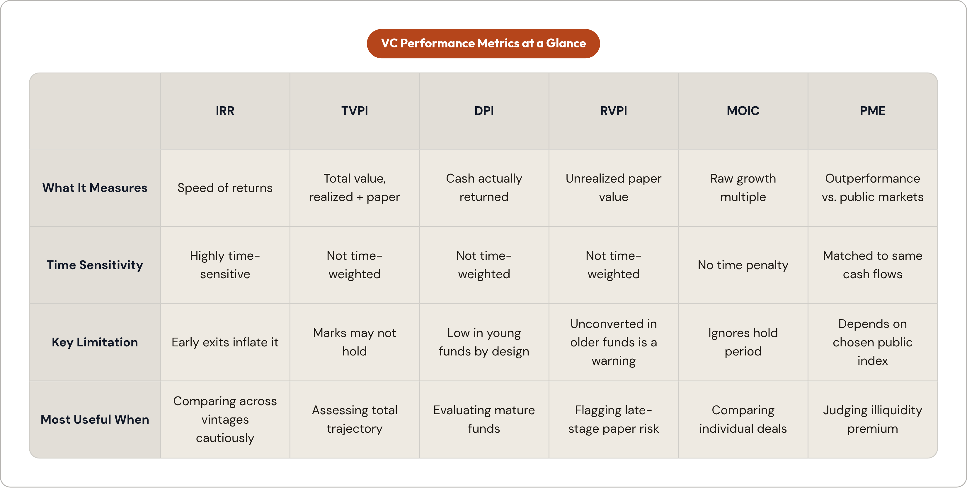
The core metrics, plainly stated:
- IRR measures how fast your money moves. A single early exit can temporarily inflate it before the rest of the portfolio has done anything. Same total return, different timing, different IRR. It's time-sensitive in a way that punishes patience and rewards lucky sequencing.
- TVPI is the total picture. Realized cash plus unrealized paper value, divided by capital invested. A 2.0x means you've theoretically doubled your money. "Theoretically" is doing a lot of work in that sentence.
- DPI is cash-on-cash. What has actually landed in an LP's account divided by what they put in. No speculation, no marks. This is the one that keeps CFOs up at night.
- RVPI is what's still on paper. When this number is high in a fund that's eight, nine, ten years old, that's a question, not a promise.
- MOIC is the raw growth multiple with no time weighting. Useful for comparing individual deals across strategies. Doesn't penalize a six-year hold versus a two-year hold the way IRR does.
- PME is the sanity check. It asks: did this fund beat what a public market investor would have earned on the same cash flows? A PME above 1.0 says yes. Below 1.0 says you paid illiquidity and fee drag to underperform the S&P.
No single metric is sufficient. IRR captures time. TVPI captures total value. DPI captures realized reality. RVPI shows what's left to convert. MOIC shows gross deal performance. Experienced LPs triangulate all five, adjusted for where the fund is in its lifecycle.
How the Major Benchmark Providers Build Their Indices
The indices you hear cited most often aren't surveys. They're proprietary databases built from funds that choose to report.
Cambridge Associates runs the most widely referenced US VC benchmark. As of mid-2024, their database covered 2,537 US VC funds formed between 1981 and 2024, representing roughly $417 billion in total value. By mid-2025, that had grown to 2,699 funds and $591 billion. Their broader private investments database covers over 9,900 funds across more than 2,400 managers and captures gross performance data on over 93,000 underlying investments.
Coverage is approximately 69% of funds by count and 69% by total commitment. Returns are net of management fees, expenses, and carried interest. They're calculated as pooled end-to-end IRRs across the aggregate of all cash flows and reported market values.
PitchBook's Horizon IRR uses a capital-weighted pooled calculation scoped to a specific time window. A one-year horizon IRR only reflects performance within that annual period. That's a fundamentally different construction than a since-inception fund IRR. Same word, different math.
Carta draws from funds on its own fund administration platform. Their Q2 2025 report covered 2,715 venture funds with vintage years 2017 through 2025, representing approximately $112.2 billion in capital commitments. Carta's data skews toward smaller and emerging managers. That's not a flaw exactly, but it's a selection bias you need to account for when using their benchmarks to evaluate a large multi-stage fund.
The construction decisions that change the answer
How you aggregate the data matters as much as which data you use.
- Pooled returns weight large funds heavily. One massive fund can move the whole index.
- Median is more representative of a typical LP's experience. It tells you what the fund in the middle of the pack actually did.
- Equal-weighted elevates small funds. Each fund counts the same regardless of size.
Same underlying data. Three different answers.
And here's the coverage gap nobody advertises. Funds that decline to report skew the sample. Non-reporting is more common among underperformers. That means published benchmarks almost certainly overstate typical performance. The funds making the index look good are disproportionately the ones showing up.
What "Good" Actually Means by Stage and Fund Size
Top-quartile across the asset class looks like 3x+ net TVPI and 22%+ net IRR. To truly justify the illiquidity premium and fee drag, a VC fund should beat its PME equivalent by roughly 300 to 500 basis points. Anything less and you're paying for complexity you didn't need.
Stage changes the target substantially:
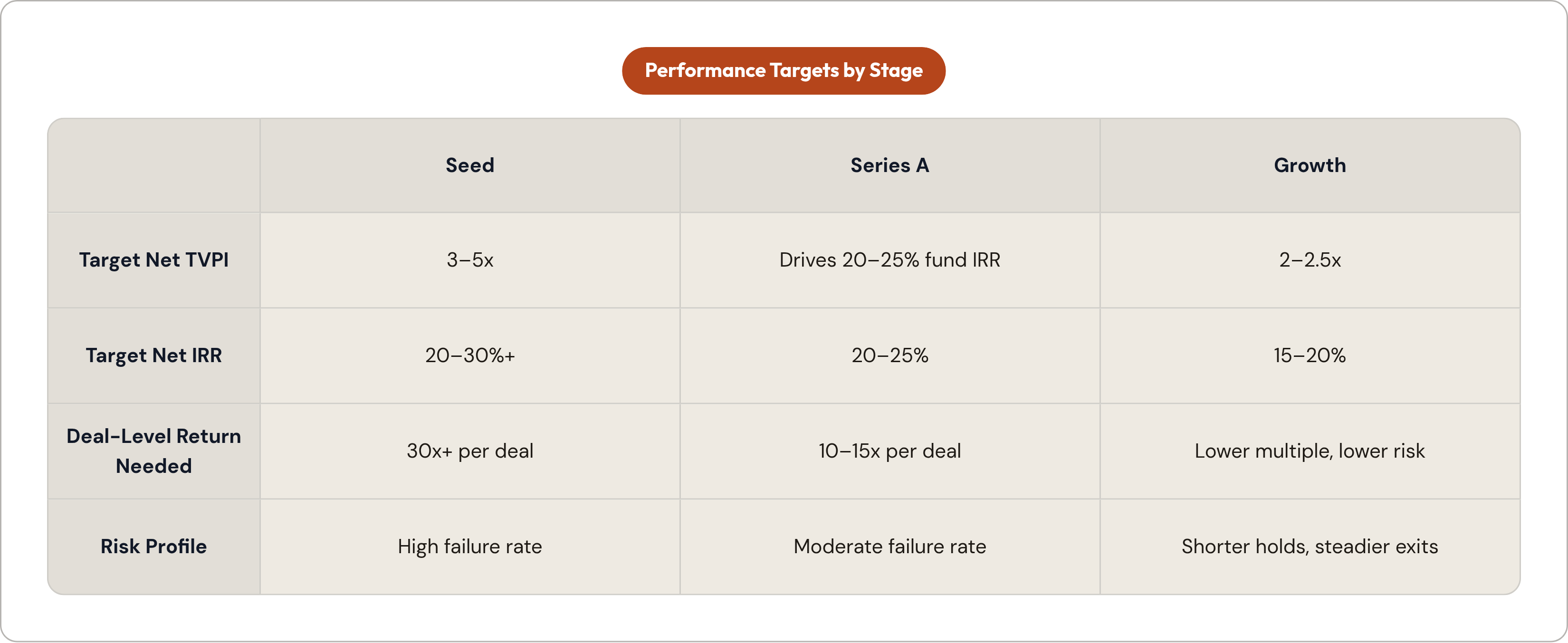
- Seed funds should be targeting 3 to 5x net TVPI and 20 to 30%+ IRR at the fund level. Individual deals often need to target 30x or more to compensate for the high percentage of companies that return nothing.
- Series A multiples at the deal level typically run 10 to 15x to produce competitive fund-level IRRs in the 20 to 25% range.
- Growth funds operate closer to 2 to 2.5x net TVPI at 15 to 20% IRR. Lower multiple target, lower risk, shorter hold periods.
A practical field guide for TVPI across the asset class:
- Above 4x is exceptional.
- 2.5x is strong.
- 1.5x is median.
- Below 1.5x is underperformance.
Median performance sets an important floor here. The typical VC fund returns somewhere between 1.5 and 2.0x TVPI. For the 2017 vintage specifically, Carta's data as of early 2025 shows a median IRR of 11.5% and median TVPI of 1.72x. That's not bad. It's also not the return profile the asset class is sold on.
The most important structural fact about venture capital: the gap between top-quartile and bottom-quartile VC funds exceeds 30 percentage points in net IRR. That spread is wider than any other private equity strategy. Benchmarks describe a distribution. Being in the right quartile matters more than the asset class average.
Vintage Year Shapes Returns More Than Manager Strategy
Here's something that takes a while to fully internalize. The same GP, the same strategy, the same team. Different vintage year. Completely different results. Benchmark comparisons are only meaningful within vintage cohorts, not across them.
The 2021 vintage is the clearest example in recent history. Those funds deployed into the highest valuation environment venture has ever seen. Average early-stage valuations rose 64% from the prior year and came in 124% above the five-year average. Later-stage valuations rose 93% from 2020 and sat 150% above the prior five-year average.
Most 2021 vintage funds took markdowns of 30 to 50% from peak. Median TVPI stabilized around 1.1x. But DPI tells the sharper story. As of five years in, 2021 vintage funds had returned just 0.08x to LPs. That's $8 million back per $100 million committed. The IPO drought that ran from 2022 through 2024 extended average hold periods from roughly 4.5 years to over 7 years. No exits, no distributions, no DPI.
Compare that to the 2022 vintage, which deployed at 40 to 60% discounts to those same 2021 peaks. Early data shows the 2022 vintage outperforming the 2021 vintage by roughly 20 to 30% at the same stage of life. Entry price matters as much as portfolio construction. Maybe more.
The 2017 vintage benefited from a completely different environment. It caught the 2020 to 2021 exit window. At the three-year mark, 25% of 2017 vintage funds had already returned some capital to LPs. For 2021 vintage funds at the same point in their lives, only 9% had done the same.
The 2023 and 2024 vintages are posting the highest early IRRs in Carta's data, largely driven by AI-related mark-ups from seed to Series A. That's worth watching carefully. Those are not realized exits. That's paper. The 2021 vintage showed the same early momentum before the market turned.
One more number worth sitting with: per Carta's Q4 2025 data, the 2025 vintage retains 72% dry powder, the 2024 vintage 53%, and the 2023 vintage 35%. Those three cohorts together represent over $19 billion still undeployed. That's a significant amount of future deployment pressure entering the market.
The J-Curve and Why IRR Looks Worst Exactly When It Should Be Trusted Most
This is one of the more counterintuitive dynamics in the asset class, and it trips people up constantly.
Here's the mechanic. Fees and expenses get paid before any exits occur. IRR is structurally negative in years one through three for almost every VC fund regardless of quality. Value builds quietly as portfolio companies grow. Distributions arrive late, and they compress the IRR calculation upward only in the fund's later years.
VC J-curves run deeper and longer than buyout J-curves. Early-stage companies take longer to mature. Exit markets are less reliable. There's no leverage-driven early return mechanism to cushion the trough.
For context, the 2021 vintage's median IRR was still negative three years after inception. That negative number reflects J-curve mechanics as much as portfolio quality. Possibly more.
DPI at year five is one of the cleaner early signals. Per Carta's analysis, more than 60% of 2019 vintage VC funds had not yet distributed any capital to LPs after five years. Half of all 2018 vintage funds had not distributed any capital as of early 2025. That's a normal pattern. Unsatisfying, but normal.
The practical read:
- A year-three fund with negative IRR is not necessarily underperforming. It's probably just doing what a year-three fund does.
- A year-eight fund with high TVPI and near-zero DPI is raising a different, more urgent question.
This is exactly why benchmark providers publish quartile data within vintage cohorts. Comparing a year-three fund's IRR to a year-eight fund's IRR is not a meaningful exercise without adjusting for age.
The DPI Drought Is Changing What LPs Treat as the Primary Metric
This is the part of the story that doesn't get enough attention in the headlines.
Since the beginning of 2022, US VC managers have called 1.6 times more capital than they have distributed. In just the first half of 2025 alone, VC managers called $26.9 billion while distributing only $16.1 billion, per Cambridge Associates. Flip back to the prior decade. From 2012 through 2021, the relationship ran the other way. Distributions ran 1.3 times calls. LPs were net positive.
That has completely reversed.
Average VC fund DPI at the eight-year mark has dropped from the 2010s average of 1.3x down to 0.7x. Distribution rates averaged single-digit percentages of NAV for eight consecutive quarters, well below the decade average of 16.8%. And since 2022, net cash flows to LPs are negative by roughly $169 billion per PitchBook-NVCA data. That's described as the most severe LP liquidity constraint since 2009.
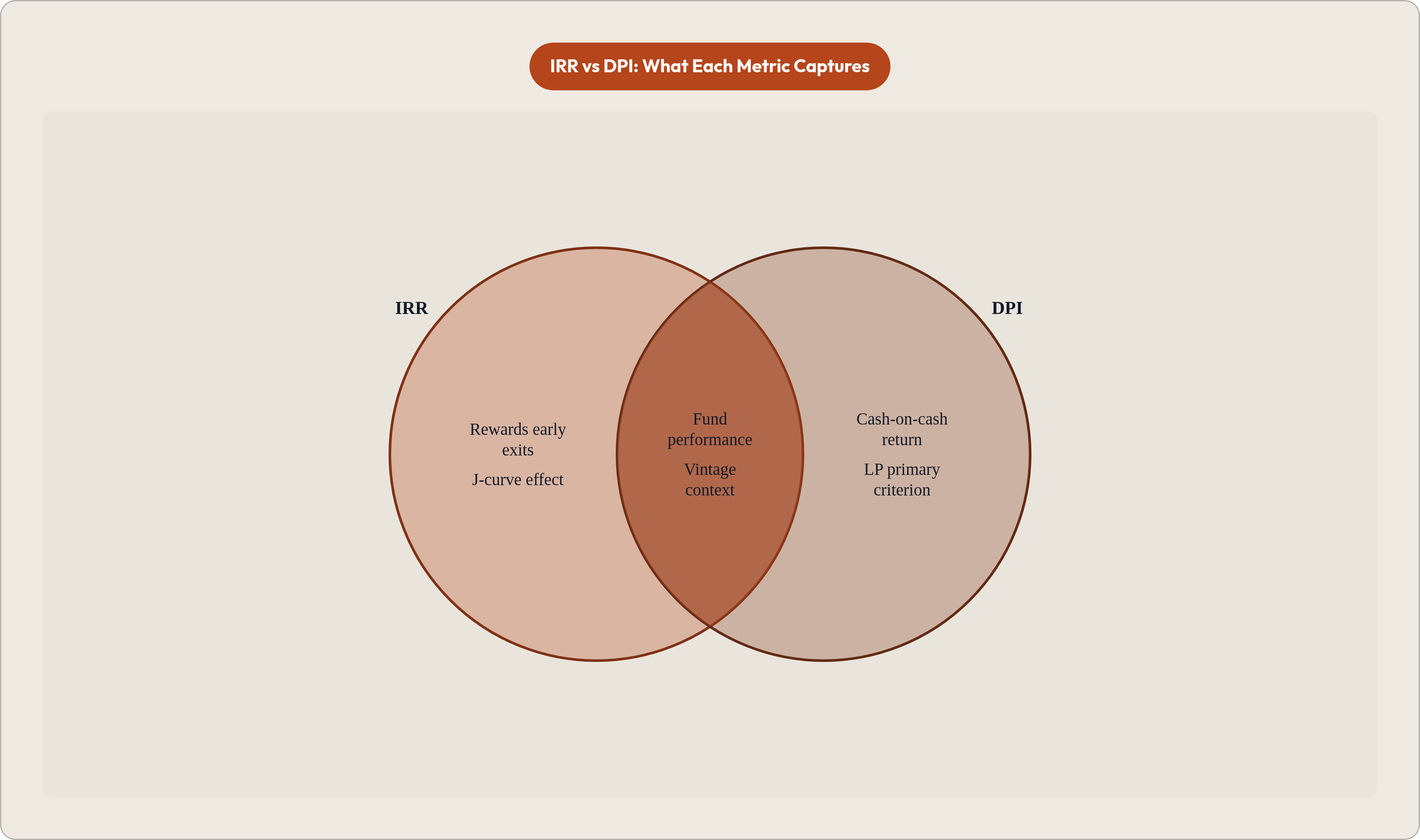
LPs have responded by shifting what they're measuring. Per a 2024 ILPA survey, 74% of institutional LPs now rank DPI as their primary criterion for re-up decisions, up from 52% five years earlier. A 22-point shift in five years is a significant change in behavior.
What this means for reading benchmarks:
- TVPI loses interpretive weight when unrealized marks are being viewed skeptically.
- DPI becomes the credibility filter. High TVPI with low DPI signals paper gains that haven't been tested by actual exits.
- High RVPI in funds from 2016 and earlier raises specific concern. The longer paper gains go unconverted, the more pressure there is on whether the GP can actually execute exits at marked valuations.
Recent Index Returns and What They Reveal About VC Versus Public Markets
The Cambridge Associates US VC Index returned 6.2% in full-year 2024, recovering from two consecutive years of negative returns in 2022 and 2023. In the first half of 2025, the index returned 6.4%, making it the fifth consecutive quarter of positive returns. The rolling one-year IRR climbed to 14.6%.
That sounds like a recovery. In some ways, it is.
Within the 2024 index, performance ranged from 2.1% for communication services all the way to 38.8% for industrials. The aggregate number masks enormous variation by sector focus. An AI-heavy fund and a consumer internet fund did not experience the same year.
The PME problem is worth being direct about. Amid historically strong large-cap public market performance, the US VC benchmark has been consistently outperforming small-cap stocks while struggling to keep pace with the S&P 500 and Nasdaq. In Cambridge Associates' H1 2025 commentary, the asset class is not currently clearing its own PME hurdle against the most accessible public benchmarks. That's a significant statement. It means the average VC fund, over this period, did not justify the illiquidity premium against the easiest comparison.
Long-run pooled returns for context: the 10-year pooled US VC net returns ran approximately 14 to 18% annualized through 2023. The five-year figure dropped to roughly 8 to 12% due to the 2022 to 2023 valuation reset. The time window you select changes the answer substantially. This is not an accident.
One more signal worth noting. In 2024, US VC managers completed slightly fewer deals by count compared to 2023 (14,612 versus 14,851), but deployed meaningfully more capital ($213 billion versus $163 billion) per NVCA-PitchBook data. Fewer deals, bigger checks. Capital is concentrating into fewer, larger rounds. AI-driven mega-rounds are inflating index value without broad portfolio improvement. The headline and the underlying picture are not the same thing.
Positive index IRR does not mean DPI has recovered. The capital call surplus persists. LP liquidity pressure remains. The index headline and the LP experience are still telling different stories.
How to Read a Benchmark Comparison Without Being Misled By It
Every time someone hands you a benchmark comparison, there are five questions that number cannot answer on its own.
- Is this fund being compared within its vintage cohort, or across vintages? Across vintages is almost meaningless.
- Is the reported IRR inflated by early exits or mark-ups that haven't been tested by distributions? Early IRR is a draft, not a result.
- What is the DPI? How much of TVPI is realized versus still on paper?
- Which provider's methodology was used, and what portion of the universe does it actually cover? Pooled, median, and equal-weighted are three different answers from the same data.
- Does the fund's PME clear the public market hurdle over the same cash flow period? If not, you paid a premium for complexity and underperformed an index fund.
The dispersion point is the final frame to carry with you. Thirty-plus percentage points of IRR spread between top- and bottom-quartile VC funds means benchmark averages and medians describe a distribution, not a target. The average is almost a fiction. The quartile is the real information.
For recent 2023 and 2024 vintage funds showing high early IRRs, recognize that those numbers are largely reflecting valuation step-ups from seed to Series A, not realized exits. The 2021 vintage showed the same early momentum before things turned. Early high IRR in a young fund is a hypothesis. It becomes evidence only when distributions follow.
What "good" means depends entirely on where the fund is in its lifecycle. For a year-three fund, TVPI trajectory and portfolio construction quality are the leading indicators. For a year-seven-plus fund, DPI relative to benchmark peers within the same vintage cohort is the defining test.
Benchmarks are most useful not as single-point comparisons but as a consistent frame of reference applied over time. A single snapshot against an index tells you much less than tracking a fund's percentile rank within its vintage cohort across multiple reporting periods. Watch the direction of travel. Watch the DPI build. Watch the gap between TVPI and what's actually been returned.
The number is a starting point. The story is in what it leaves out.